As always, these small business website design analyses are here so you can see examples of website designs that incorporate all of the 5 essentials of business website design. I?m your host Shannon Johnson (PostcardMania?s Web Design Specialist), and my next analysis comes from the real estate industry. The business, Project NewLeaf, is based out of Arlington, VA.
See the site in action: www.project-newleaf.com
Design
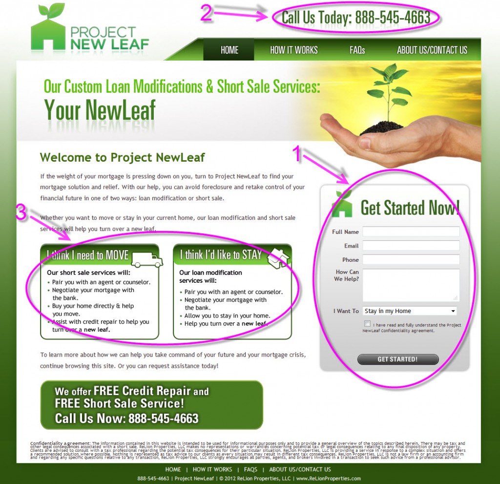
As you would expect from a company with ?leaf? in the name, green is the dominant color on their homepage. I have no issue with this, especially because of the market that they are reaching out to. Their market is individuals and families that are struggling to make their mortgage payments. These people are under a great deal of stress, so you don?t want to give them too much information to process at one time, or they may become overwhelmed and abandon your site. So the intuitive green color choice is the right one, as is the very clean and simple design layout of the homepage. The information you need is clearly presented, and you don?t have to jump though hoops to get it.

Marketing
There are 3 specific things related to the marketing on the website that I want to mention.
1. The form ? I love that their form is right there on the homepage, though I would probably use the report they offer at the bottom of the page as the reason to fill it out, since people might not be ready to get started right away.
2. Number in the top right corner ? The contact info is easy to find and available on every page.
3. Move/Stay Boxes ? This is a great touch, because it allows visitors to immediately see what NewLeaf can do for them in their particular situation. Anytime you can present info that is exactly what the prospect is looking for, you are in good shape.

SEO (Search Engine Optimization)
SEO is the practice of optimizing the copy on your website so that search engines can understand what your website is about and how they should rank it for particular keywords. The site is optimized for the keywords ?short sale? and ?loan modification?, since these are the two main areas in which the business operates. It is also optimized for ?Virginia?, because this is the area that they service.
Copywriting
What I like particularly about the copy on this site is how direct and to-the-point it is without being businesslike. Sometimes it is difficult to write clearly and compellingly without losing the human tone in the writing. This site does this wonderfully, so the writing is warm-but-brief.
Programming
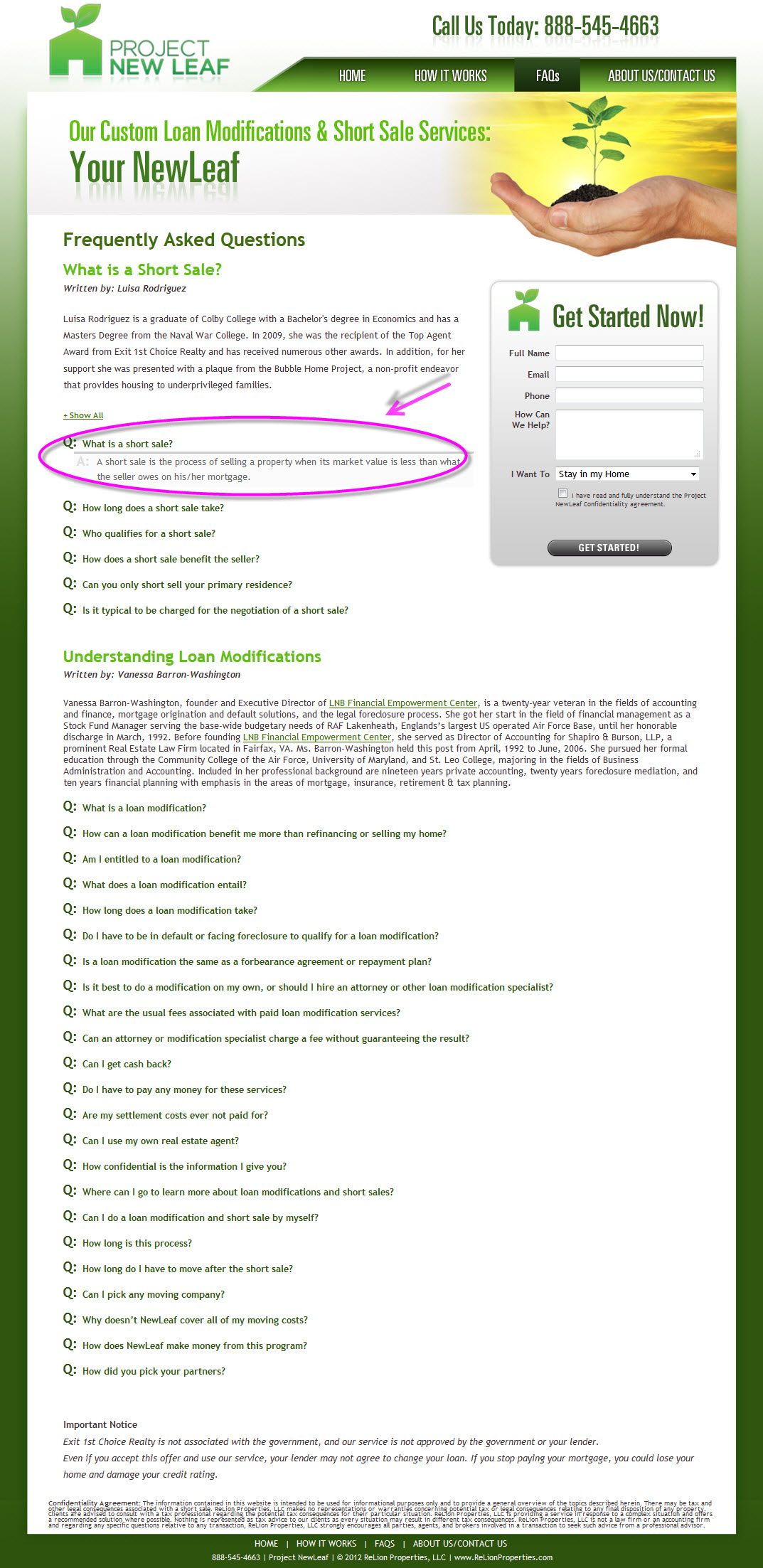
Quality programming is tough to see, because usually if you are noticing the programming it?s because it isn?t working properly. One thing I liked was the FAQ page. You can click on the question that applies to you and the answer scrolls down from the question, so you don?t have to scroll down to find it. It also saves you from having to read a bunch of other answers you don?t care about. A nice time-saving touch.

Was this helpful? Let?s get the conversation going in the comments.
Best,
Shannon
?

jr martinez melasma jimmy rollins jimmy rollins let it snow jason trawick jerry lewis
No comments:
Post a Comment
Note: Only a member of this blog may post a comment.